We’ve all been there, right at the center of a miscommunication. In this age of information, accurately presenting data is extremely important, especially since data is at the heart of every decision-making process, from business strategies to scientific research. A miscommunication of data can cause anything from minor misunderstandings to significant financial or intellectual loss. Therefore, the effective communication is both an art and science that requires creativity and skill.
In this article, we’ll review some of the best tips for effectively presenting data, so that you can feel confident your message is landing with your audience. We’ll discuss what makes a great data presentation (from the visuals to the script), how to tailor your message to the specific audience you’re presenting to, and some examples of data presentations done right.
If it were easy, everyone would be doing it! But truthfully, it’s difficult for a few reasons. Firstly, people have shorter attention spans than ever. You might have a ton of data to present, but if you’re not doing it in a visually-appealing way that gets straight to the point, your point might just be lost in the mix. Secondly, it’s often difficult to distill large amounts of data into understandable pieces of information. If you try to make a ton of bar graphs or charts to summarize data, you might end up overwhelming your audience with too much information, so the most important information gets buried. Thirdly, not everything needs to be presented, and people may often make the mistake of presenting everything versus the important things. Having the skill and knowledge necessary to hone in on the most important data is the first step to a great presentation.

One of the worst things that can happen is you present all of your hard work and data analysis, and nobody understands what you’re talking about. It’s tough work, analyzing tons of data (trust me, I know). When presenting information, you have the ability to present complex, raw data into a form that any audience should be able to understand. When completed thoughtfully, you can translate complex, raw data into an understandable form. That way, your audience can appreciate the insights, and subsequently make informed decisions.
The benefits of effective data presentations include:
A great data presentation is clear, accurate, and relevant. It doesn’t overload the audience with information and concisely presents the necessary points. Let’s break it down a little bit further into a few key factors.
Cohesion and Consistency
A great presentation has cohesive elements that bring everything together. By maintaining consistent fonts, background colors, and image alignment, you can ensure a sore thumb of a visual in your slide doesn’t pull the audience’s attention away from what matters.
Choosing the Proper Visualization Aids
And when it comes to visual aids, make sure they make sense for the context of the presentation. If you’re presenting data on the correlation between Ad Spend on Facebook and orders in your online store, then maybe you don’t need a giant image of a peacock in the bottom right of your slide. Use the right graphs or images to get your point across, and use them only when necessary.
Tailor Data to the Audience
Some audiences are professional, others are a little loose. Depending which audience is in front of you, you’re required to tailor how you present the information at hand. Don’t be afraid to show a little personality, as we all know data presentation can be a little dry. Make it more interesting by tying your data to real-world examples, include multimedia whenever possible, and make it engaging and entertaining.

I can assume we’ve all been there, watching a presentation where every concept goes completely over our heads. It doesn’t feel good, and it’s a great way to turn an audience off. As a former science communicator, one great piece of advice I received was to assume everyone is a beginner. By tailoring a presentation to a novice with minimal exposure to the content at hand, you’re able to confidently present information knowing you’re reaching everyone in the audience, and that everyone derives value from what you’re presenting.
When starting to work on a presentation, the first question you should ask yourself is: “what do I want people to know after watching this?” The way you present your data should fall in line with what the main takeaway will be, and this will inform your visuals.
While a table can have the same information as a bar graph, a bar graph is not only more appealing to the eyes, it’s better at conveying the relationship between pieces of data (which is the whole point of the presentation!). So if the main message of my presentation is how X is strongly correlated with Y, then I’ll be sure to include a large graph showing that strong, undeniable relationship between the two.
Finally, Keep it Simple, Smartie. The KISS method applies in so many areas of life, and it definitely applies here. Use simple language, tell a story with the data, and focus on the key insights. You may have discovered 25 interesting data trends when completing your research. Make your presentation about the top 5 to maintain that interest.
Take a look at the above presentation from our Chief Evangelist, Rabah Rahil. Throughout the presentation, Rabah uses clear language and easy to understand graphs to ensure everyone is picking up what he’s putting down.
Take a look at the above presentation from our Chief Evangelist, Rabah Rahil. Throughout the presentation, Rabah uses clear language and easy to understand graphs to ensure everyone is picking up what he’s putting down.

In the graph above, we can gather quickly that the blended ad spend by week has a gigantic peak during the week of Black Friday, and also still shows growth in the period following. By having clearly labeled axes and a bold call-out to the peak he’s emphasizing in his verbal delivery of the presentation. By combining visual cues with the speech itself, Rabah is able to reach a few of the different types of learners: Visual, Auditory, Read/Write, or Kinesthetic.
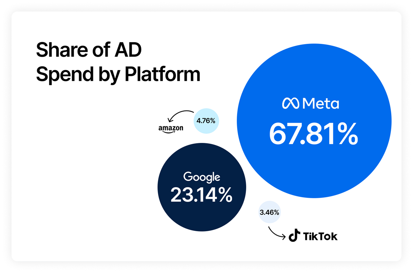
Rabah also adjusted the visuals used depending on the type of data presented. For example, in the following comparison of ad spend across platforms by industry, we can see that certain industries (Health & Beauty and Clothing) have an extremely high ad spend in comparison to other industries. Additionally, a call-out with a red box points out that these industries are also spending more on TikTok and Snapchat compared to the others.

Rabah’s presentation overall is quick, to the point, and uses data to back up what he’s explaining, and we love a great data presentation. Want to understand your own data a little better? See if Triple Whale can help you pick out the trends in your own business to make better decisions.
And it’s not just for businesses themselves, but agencies have shared how important great visualizations of data are for working with clients. HYPE10, a digital marketing agency focused on growing DTC brands, stated that Triple Whale’s Summary Page is more than just a snapshot of key metrics, it’s HYPE10’s starting point for all client interactions. By utilizing the summary page to visualize data, HYPE10 is able to provide clients a concise overview of performance to align their goals for scaling going forward.
In a world where data drives decisions, the ability to present it effectively has become paramount. The complexities involved in crafting a meaningful and engaging data presentation are multifaceted, encompassing everything from understanding your audience to choosing the right visual aids and maintaining visual consistency. This article has peeled back the layers of what it takes to transform raw, intricate data into an accessible, relatable story that resonates with your audience.
Whether it's the challenge of keeping attention in an age of information overload, the artistry of translating complex insights into digestible nuggets, or the ethical responsibility of representing data accurately, the quest for effective data presentation is indeed a delicate dance of art and science. We've explored examples that embody these principles, and the underlying message is clear: keeping it simple, relevant, and visually appealing is the way to ensure that your hard work in data analysis doesn’t go unnoticed.
Data is King, and mastering the art of data presentation isn't just a nice skill to have – it's a need. Embracing the tips and understanding the principles laid out in this article can take your presentations from mundane to memorable. Because at the end of the day, data itself is just numbers - it’s how you communicate it that matters!
We’ve all been there, right at the center of a miscommunication. In this age of information, accurately presenting data is extremely important, especially since data is at the heart of every decision-making process, from business strategies to scientific research. A miscommunication of data can cause anything from minor misunderstandings to significant financial or intellectual loss. Therefore, the effective communication is both an art and science that requires creativity and skill.
In this article, we’ll review some of the best tips for effectively presenting data, so that you can feel confident your message is landing with your audience. We’ll discuss what makes a great data presentation (from the visuals to the script), how to tailor your message to the specific audience you’re presenting to, and some examples of data presentations done right.
If it were easy, everyone would be doing it! But truthfully, it’s difficult for a few reasons. Firstly, people have shorter attention spans than ever. You might have a ton of data to present, but if you’re not doing it in a visually-appealing way that gets straight to the point, your point might just be lost in the mix. Secondly, it’s often difficult to distill large amounts of data into understandable pieces of information. If you try to make a ton of bar graphs or charts to summarize data, you might end up overwhelming your audience with too much information, so the most important information gets buried. Thirdly, not everything needs to be presented, and people may often make the mistake of presenting everything versus the important things. Having the skill and knowledge necessary to hone in on the most important data is the first step to a great presentation.
One of the worst things that can happen is you present all of your hard work and data analysis, and nobody understands what you’re talking about. It’s tough work, analyzing tons of data (trust me, I know). When presenting information, you have the ability to present complex, raw data into a form that any audience should be able to understand. When completed thoughtfully, you can translate complex, raw data into an understandable form. That way, your audience can appreciate the insights, and subsequently make informed decisions.
The benefits of effective data presentations include:
A great data presentation is clear, accurate, and relevant. It doesn’t overload the audience with information and concisely presents the necessary points. Let’s break it down a little bit further into a few key factors.
Cohesion and Consistency
A great presentation has cohesive elements that bring everything together. By maintaining consistent fonts, background colors, and image alignment, you can ensure a sore thumb of a visual in your slide doesn’t pull the audience’s attention away from what matters.
Choosing the Proper Visualization Aids
And when it comes to visual aids, make sure they make sense for the context of the presentation. If you’re presenting data on the correlation between Ad Spend on Facebook and orders in your online store, then maybe you don’t need a giant image of a peacock in the bottom right of your slide. Use the right graphs or images to get your point across, and use them only when necessary.
Tailor Data to the Audience
Some audiences are professional, others are a little loose. Depending which audience is in front of you, you’re required to tailor how you present the information at hand. Don’t be afraid to show a little personality, as we all know data presentation can be a little dry. Make it more interesting by tying your data to real-world examples, include multimedia whenever possible, and make it engaging and entertaining.
I can assume we’ve all been there, watching a presentation where every concept goes completely over our heads. It doesn’t feel good, and it’s a great way to turn an audience off. As a former science communicator, one great piece of advice I received was to assume everyone is a beginner. By tailoring a presentation to a novice with minimal exposure to the content at hand, you’re able to confidently present information knowing you’re reaching everyone in the audience, and that everyone derives value from what you’re presenting.
When starting to work on a presentation, the first question you should ask yourself is: “what do I want people to know after watching this?” The way you present your data should fall in line with what the main takeaway will be, and this will inform your visuals.
While a table can have the same information as a bar graph, a bar graph is not only more appealing to the eyes, it’s better at conveying the relationship between pieces of data (which is the whole point of the presentation!). So if the main message of my presentation is how X is strongly correlated with Y, then I’ll be sure to include a large graph showing that strong, undeniable relationship between the two.
Finally, Keep it Simple, Smartie. The KISS method applies in so many areas of life, and it definitely applies here. Use simple language, tell a story with the data, and focus on the key insights. You may have discovered 25 interesting data trends when completing your research. Make your presentation about the top 5 to maintain that interest.
Take a look at the above presentation from our Chief Evangelist, Rabah Rahil. Throughout the presentation, Rabah uses clear language and easy to understand graphs to ensure everyone is picking up what he’s putting down.
Take a look at the above presentation from our Chief Evangelist, Rabah Rahil. Throughout the presentation, Rabah uses clear language and easy to understand graphs to ensure everyone is picking up what he’s putting down.
In the graph above, we can gather quickly that the blended ad spend by week has a gigantic peak during the week of Black Friday, and also still shows growth in the period following. By having clearly labeled axes and a bold call-out to the peak he’s emphasizing in his verbal delivery of the presentation. By combining visual cues with the speech itself, Rabah is able to reach a few of the different types of learners: Visual, Auditory, Read/Write, or Kinesthetic.
Rabah also adjusted the visuals used depending on the type of data presented. For example, in the following comparison of ad spend across platforms by industry, we can see that certain industries (Health & Beauty and Clothing) have an extremely high ad spend in comparison to other industries. Additionally, a call-out with a red box points out that these industries are also spending more on TikTok and Snapchat compared to the others.
Rabah’s presentation overall is quick, to the point, and uses data to back up what he’s explaining, and we love a great data presentation. Want to understand your own data a little better? See if Triple Whale can help you pick out the trends in your own business to make better decisions.
And it’s not just for businesses themselves, but agencies have shared how important great visualizations of data are for working with clients. HYPE10, a digital marketing agency focused on growing DTC brands, stated that Triple Whale’s Summary Page is more than just a snapshot of key metrics, it’s HYPE10’s starting point for all client interactions. By utilizing the summary page to visualize data, HYPE10 is able to provide clients a concise overview of performance to align their goals for scaling going forward.
In a world where data drives decisions, the ability to present it effectively has become paramount. The complexities involved in crafting a meaningful and engaging data presentation are multifaceted, encompassing everything from understanding your audience to choosing the right visual aids and maintaining visual consistency. This article has peeled back the layers of what it takes to transform raw, intricate data into an accessible, relatable story that resonates with your audience.
Whether it's the challenge of keeping attention in an age of information overload, the artistry of translating complex insights into digestible nuggets, or the ethical responsibility of representing data accurately, the quest for effective data presentation is indeed a delicate dance of art and science. We've explored examples that embody these principles, and the underlying message is clear: keeping it simple, relevant, and visually appealing is the way to ensure that your hard work in data analysis doesn’t go unnoticed.
Data is King, and mastering the art of data presentation isn't just a nice skill to have – it's a need. Embracing the tips and understanding the principles laid out in this article can take your presentations from mundane to memorable. Because at the end of the day, data itself is just numbers - it’s how you communicate it that matters!

Body Copy: The following benchmarks compare advertising metrics from April 1-17 to the previous period. Considering President Trump first unveiled his tariffs on April 2, the timing corresponds with potential changes in advertising behavior among ecommerce brands (though it isn’t necessarily correlated).


.webp)

.webp)

.png)


.png)